一 : Android开发UI之Button
前言
最近一直在讲androidUI控件的使用方式,这篇文章讲解一下基本上属于用处最广泛的控件之一的Button控件。如果有过其他平台开发经验的程序员,对按钮是不会陌生的。本篇文章首先讲解一下Android的Button控件的常用事件以及事件绑定和触发,再在Button控件中通过设定属性值来实现图文混排,这个功能是在项目中常用到的。
Button控件
Button继承了TextView。它的功能就是提供一个按钮,这个按钮可以供用户点击,当用户对按钮进行操作的时候,触发相应事件,如点击,触摸。
还有一个ImageButton,它继承自Button,可以在ImageButton中显示一个图片展示给用户看,并且对其Text属性设置值的时候是无效的,其它功能与Button一样。
常用事件
一般对于一个按钮而言,用的最多的就是点击事件,Button间接继承自View,而AndroidUI中的所有事件,都是定义在View中的。在本篇博客中,示例讲解的点击事件、触摸事件,其他事件的使用方式与此类似,只是触发的时机不同而已。此处分别需要实现View.OnClickListener、View.OnTouchListener接口的方法。
下面使用一个示例讲解一下事件的绑定及触发,在示例中显示两个按钮控件,一个为普通按钮,一个为填充图片的按钮,为它们绑定click事件,当点击事件触发的时候,对其尺寸进行修改,为图片按钮绑定触摸事件,当触摸的时候触发,切换图片显示。
布局代码:
- <?xmlversion="1.0"encoding="utf-8"?>
- <LinearLayoutxmlns:android="http://schemas.android.com/apk/res/android"
- android:layout_width="match_parent"
- android:layout_height="match_parent"
- android:orientation="vertical">
- <Button
- android:id="@+id/btnChangeSize"
- android:layout_width="wrap_content"
- android:layout_height="wrap_content"
- android:text="点击修改尺寸"
- />
- <Button
- android:id="@+id/btnChangeImg"
- android:layout_width="wrap_content"
- android:layout_height="wrap_content"
- android:background="@drawable/image1"
- />
- </LinearLayout>
实现代码:
- packagecom.bgxt.buttondemo;
- importandroid.app.Activity;
- importandroid.os.Bundle;
- importandroid.view.MotionEvent;
- importandroid.view.View;
- importandroid.view.View.OnClickListener;
- importandroid.view.View.OnTouchListener;
- importandroid.widget.Button;
- //通过实现接口,对其进行click、touch事件的支持
- publicclassButtonListenerextendsActivityimplementsOnClickListener,
- OnTouchListener{
- privateButtonbtnChangeSize;
- privateButtonbtnChangeImg;
- privateintflag=1;
- @Override
- protectedvoidonCreate(BundlesavedInstanceState){
- super.onCreate(savedInstanceState);
- setContentView(R.layout.btn_listener);
- btnChangeSize=(Button)findViewById(R.id.btnChangeSize);
- btnChangeImg=(Button)findViewById(R.id.btnChangeImg);
- //对两个按钮进行事件绑定
- btnChangeSize.setOnClickListener(this);
- btnChangeImg.setOnClickListener(this);
- btnChangeImg.setOnTouchListener(this);
- }
- @Override
- publicbooleanonTouch(Viewv,MotionEventevent){
- //获取触发事件的Button控件
- Buttonbtn=(Button)v;
- if(event.getAction()==MotionEvent.ACTION_UP){
- //当触摸时按下,则替换展示图片为image1
- btn.setBackgroundResource(R.drawable.image1);
- }else{
- btn.setBackgroundResource(R.drawable.image2);
- }
- returnfalse;
- }
- @Override
- publicvoidonClick(Viewv){
- Buttonbtn=(Button)v;
- if(flag==1
- &&btn.getWidth()==getWindowManager().getDefaultDisplay()
- .getWidth()){
- //如果等于屏幕的宽度,则修改标识flag为-1
- flag=-1;
- }elseif(flag==-1&&btn.getWidth()<100){
- flag=1;
- }
- //设置button控件尺寸
- btn.setWidth(btn.getWidth()+(int)(btn.getWidth()*0.1)*flag);
- btn.setHeight(btn.getHeight()+(int)(btn.getHeight()*0.1)*flag);
- }
- }
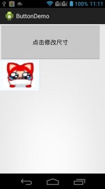
展示效果图:

当点击按钮的时候,按钮被放大,当放大到屏幕宽度时,开始缩小。
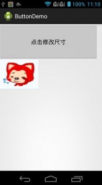
当触摸图标按钮的时候,图像改变。
图文混排
对于在实际项目中,经常会需要设置按钮展示为图文混排的效果,这样可以通过图表更直观的把按钮的功能展示给用户,又可以有简短的文字说明。虽然ImageButton也可以实现图片按钮的效果,但是对于ImageButton而言,设置Text属性是没有作用的,所以这里不讲解ImageButton的使用。对于Button控件,图文混排需要用到一个android:drawableXxx属性(Xxx为图片所在按钮的方向),这个属性配合android:text,就可以实现图文混排的效果。
下面一个示例,分别展示了上下左右四个方位的图标按钮,并且生成一个通过Java代码动态生成图文混排按钮的。因为Button是继承自TextView的,所以通过代码设置图文混排的方式与TextView类似,都需要用到SpannableString类。
布局代码:
- <?xmlversion="1.0"encoding="utf-8"?>
- <LinearLayoutxmlns:android="http://schemas.android.com/apk/res/android"
- android:layout_width="match_parent"
- android:layout_height="match_parent"
- android:orientation="vertical">
- <LinearLayout
- android:layout_width="match_parent"
- android:layout_height="150dp"
- android:orientation="horizontal">
- <!--图片在上,项目中常用这样的设置-->
- <Button
- android:layout_width="wrap_content"
- android:layout_height="wrap_content"
- android:drawableTop="@drawable/image2"
- android:text="b1"/>
- <!--图片在下-->
- <Button
- android:layout_width="wrap_content"
- android:layout_height="wrap_content"
- android:drawableBottom="@drawable/image2"
- android:drawablePadding="10dp"
- android:text="b2"/>
- <!--图片在左-->
- <Button
- android:layout_width="wrap_content"
- android:layout_height="wrap_content"
- android:drawableLeft="@drawable/image2"
- android:text="b3"/>
- <!--图片在右-->
- <Button
- android:layout_width="wrap_content"
- android:layout_height="wrap_content"
- android:drawablePadding="10dp"
- android:drawableRight="@drawable/image2"
- android:text="b4"/>
- </LinearLayout>
- <!--声明一个空的按钮,用于进行代码设置-->
- <Buttonandroid:layout_width="200dp"android:layout_height="200dp"android:id="@+id/btnSty"android:layout_marginTop="10dp"/>
- </LinearLayout>
Java实现代码:
- packagecom.bgxt.buttondemo;
- importandroid.app.Activity;
- importandroid.graphics.Bitmap;
- importandroid.graphics.BitmapFactory;
- importandroid.os.Bundle;
- importandroid.text.SpannableString;
- importandroid.text.Spanned;
- importandroid.text.style.ImageSpan;
- importandroid.widget.Button;
- publicclassButtonStyleextendsActivity{
- privateButtonbtnSty;
- @Override
- protectedvoidonCreate(BundlesavedInstanceState){
- //TODOAuto-generatedmethodstub
- super.onCreate(savedInstanceState);
- setContentView(R.layout.btn_style);
- //获取按钮控件
- btnSty=(Button)findViewById(R.id.btnSty);
- //生成SpannableString,用于图片的载体
- SpannableStringspannebleLeft=newSpannableString("left");
- Bitmapbitmapleft=BitmapFactory.decodeResource(getResources(),R.drawable.image1);
- ImageSpanimageSpanLeft=newImageSpan(ButtonStyle.this,bitmapleft);
- spannebleLeft.setSpan(imageSpanLeft,0,4,Spanned.SPAN_EXCLUSIVE_EXCLUSIVE);
- SpannableStringspannebleRight=newSpannableString("right");
- BitmapbitmapRight=BitmapFactory.decodeResource(getResources(),R.drawable.image2);
- ImageSpanimageSpanRight=newImageSpan(ButtonStyle.this,bitmapRight);
- spannebleRight.setSpan(imageSpanRight,0,5,Spanned.SPAN_EXCLUSIVE_EXCLUSIVE);
- //把生成的SpannableString追加到按钮上
- btnSty.append(spannebleLeft);
- btnSty.append("aLi");
- btnSty.append(spannebleRight);
- }
- }
效果展示:

总结
对于实际项目而言,一般按钮的样式都会通过额外的XML样式文件包装一下,这个之后再介绍,这里只是介绍一下Button的简单使用。按钮的最多用处就是供用户点击从而触发相应时间,没有什么难点。
二 : DRM | Android开发
在本文档中
三 : Android开发UI之Radio、Check、Toggle
前言
这篇文章讲解一下Android平台下,RadioButton、CheckBox以及ToggleButton三个控件的用法,因为这三个控件之中都存在一个选中或是没选中的状态,所以放在一起讲解。
这三个控件均是从Button之中间接继承而来的,所以一些Button中的设置都是通用的,如图文混排,动态修改显示内容,因为之前已经对这些内容进行了说明,如果不清楚朋友可以参见一下另外一篇文章:Android开发UI之Button,所以这篇文章只是就这三个控件的常用方法进行简要说明,并给出示例。
CompoundButton
RadioButton(单选按钮)、CheckBox(复选按钮)、ToggleButton(开关按钮)都继承自android.widget.CompoundButton类,而CompoundButton又继承自Button类,在这个类中封装了一个checked属性,用于判断是否被选中,这也是它与Button的不同,对其进行了扩展,这个属性在这三个控件中的用法是一样的。
一般checked属性通过以下方式来设置与获取:
RadioButton
RadioButton,为一个单选按钮,一般配合RadioGroup一起使用,在同一RadioGroup内,所有的RadioButton的选中状态为互斥,它们有且只有一个RadioButton被选中,但是在不同的RadioGroup中是不相互影响的。
下面通过一个简单的示例来说明一下,在示例中会存在两个RadioButton,用于定义性别信息,当用户选中了某个后,点击按钮,把选中的信息提示到屏幕上。
布局代码:
- <?xmlversion="1.0"encoding="utf-8"?>
- <LinearLayoutxmlns:android="http://schemas.android.com/apk/res/android"
- android:layout_width="match_parent"
- android:layout_height="match_parent"
- android:orientation="vertical">
- <TextView
- android:layout_width="fill_parent"
- android:layout_height="wrap_content"
- android:text="Gender:"/>
- <!--定义一个RadioGroup用于包装RadioButton-->
- <RadioGroup
- android:id="@+id/gender"
- android:layout_width="wrap_content"
- android:layout_height="wrap_content">
- <RadioButton
- android:layout_width="wrap_content"
- android:layout_height="wrap_content"
- android:text="male"/>
- <RadioButton
- android:layout_width="wrap_content"
- android:layout_height="wrap_content"
- android:text="female"/>
- </RadioGroup>
- <Button
- android:id="@+id/btnGender"
- android:layout_width="fill_parent"
- android:layout_height="wrap_content"
- android:text="选择性别"/>
- </LinearLayout>
实现代码:
- packagecom.example.changebutton;
- importandroid.app.Activity;
- importandroid.os.Bundle;
- importandroid.view.View;
- importandroid.widget.Button;
- importandroid.widget.RadioButton;
- importandroid.widget.RadioGroup;
- importandroid.widget.Toast;
- publicclassRadioButtonActivityextendsActivity{
- privateRadioGroupgroup;
- privateButtonbtnGender;
- @Override
- protectedvoidonCreate(BundlesavedInstanceState){
- //TODOAuto-generatedmethodstub
- super.onCreate(savedInstanceState);
- setContentView(R.layout.radiobutton_layout);
- group=(RadioGroup)findViewById(R.id.gender);
- btnGender=(Button)findViewById(R.id.btnGender);
- btnGender.setOnClickListener(newView.OnClickListener(){
- @Override
- publicvoidonClick(Viewv){
- //获取单选按钮的选项个数
- intlen=group.getChildCount();
- StringmsgString="";
- for(inti=0;i<len;i++){
- //RadioGroup中包含的子View就是一个RadioButton
- RadioButtonradiobutton=(RadioButton)group.getChildAt(i);
- if(radiobutton.isChecked()){
- //如果被选中,则break循环,并且记录选中信息
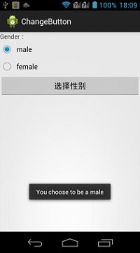
- msgString="Youchoosetobea"
- +radiobutton.getText().toString();
- break;
- }
- }
- if(msgString.equals("")){
- Toast.makeText(RadioButtonActivity.this,
- "Pleaseselectagender!",Toast.LENGTH_SHORT)
- .show();
- }else{
- Toast.makeText(RadioButtonActivity.this,msgString,
- Toast.LENGTH_SHORT).show();
- }
- }
- });
- }
- }
实现效果:
CheckBox
CheckBox是一个复选按钮,它的用法与RadioButton很像,但是与之不同的是,它可以多选,所以也无需用一个组控件包裹起来。
这里涉及了一动态添加UI控件的知识,在Android中动态增加控件一般有两种方式:
这里通过一个示例来说明CheckBox的使用,在示例中动态添加了CheckBox的选项,并且对其进行选中之后提示选中信息。上面两种方式都用用到,通过一个chooseMethod(boolean)区分。
布局代码:
- <?xmlversion="1.0"encoding="utf-8"?>
- <LinearLayoutxmlns:android="http://schemas.android.com/apk/res/android"
- android:layout_width="match_parent"
- android:layout_height="match_parent"
- android:orientation="vertical"
- android:id="@+id/checkLayout">
- <!--这里只是定义了一个按钮,其他的CheckBox控件在代码中动态添加-->
- <Button
- android:id="@+id/checkBtn"
- android:layout_width="fill_parent"
- android:layout_height="wrap_content"
- android:text="确定"/>
- </LinearLayout>
如果使用动态填充的方式获取CheckBox的话,需要添加一个CheckBox的XML文件,代码如下:
- <?xmlversion="1.0"encoding="utf-8"?>
- <CheckBoxxmlns:android="http://schemas.android.com/apk/res/android"
- android:layout_width="match_parent"
- android:layout_height="wrap_content">
- </CheckBox>
实现代码:
- packagecom.example.changebutton;
- importjava.util.ArrayList;
- importjava.util.List;
- importandroid.app.Activity;
- importandroid.app.AlertDialog;
- importandroid.os.Bundle;
- importandroid.view.View;
- importandroid.view.View.OnClickListener;
- importandroid.widget.Button;
- importandroid.widget.CheckBox;
- importandroid.widget.LinearLayout;
- publicclassCheckBoxActivityextendsActivityimplementsOnClickListener{
- privateList<CheckBox>checkBoxs=newArrayList<CheckBox>();
- privateButtoncheckBtn;
- @Override
- protectedvoidonCreate(BundlesavedInstanceState){
- super.onCreate(savedInstanceState);
- chooseMethod(false);
- checkBtn=(Button)findViewById(R.id.checkBtn);
- checkBtn.setOnClickListener(this);
- }
- @Override
- publicvoidonClick(Viewv){
- Strings="";
- //循环cheackBoxs
- for(CheckBoxc:checkBoxs){
- if(c.isChecked()){
- //如果选中就添加选中结果到msg中。
- s+=c.getText()+"\n";
- }
- }
- if("".equals(s)){
- s="您没有选中选项!";
- }
- //使用对话框弹出选中的信息
- newAlertDialog.Builder(this).setMessage(s)
- .setPositiveButton("Exit",null).show();
- }
- privatevoidchooseMethod(booleanb){
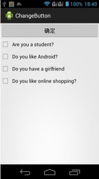
- String[]checkboxText=newString[]{"Youarestudent?",
- "DoyoulikeAndroid?","Doyouhaveagirlfriend",
- "Doyoulikeonlineshopping?"};
- if(b){
- //使用本文中提到的第一种方式,通过Id动态加载
- setContentView(R.layout.checkbox_layout);
- //获取带填充的布局控件
- LinearLayoutlinearLayout=(LinearLayout)this
- .findViewById(R.id.checkLayout);
- //根据数组,循环添加内容
- for(inti=0;i<checkboxText.length;i++){
- CheckBoxcheckbox=newCheckBox(this);
- checkBoxs.add(checkbox);
- checkBoxs.get(i).setText(checkboxText[i]);
- //把CheckBox加入到布局控件中
- linearLayout.addView(checkbox);
- }
- }else{
- //通过动态填充的方式,找到布局文件
- LinearLayoutlinearLayout=(LinearLayout)getLayoutInflater()
- .inflate(R.layout.checkbox_layout,null);
- for(inti=0;i<checkboxText.length;i++){
- //在通过动态填充的方式找到CheckBox的文件
- CheckBoxcheckbox=(CheckBox)getLayoutInflater().inflate(
- R.layout.cheackbox,null);
- checkBoxs.add(checkbox);
- checkBoxs.get(i).setText(checkboxText[i]);
- linearLayout.addView(checkbox);
- }
- //最后把这个布局文件加载显示
- setContentView(linearLayout);
- }
- }
- }
实现效果
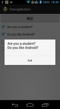
ToggleButton
ToggleButton,一个开关按钮,有两个状态,大抵的用法与上面两个控件一直,可以通过两个属性显示不同状态时,控件内显示文字的内容不同,属性如下:
ToggleButton,这个控件有一个OnCheckedChangeListener()事件,当开关的状态切换的时候会被触发,其中需要传递一个OnCheckedChangeListener接口的实现内,当被切换时,触发其中的onCheckedChange()方法,可以在其中写需要实现的功能代码。
下面通过一个示例讲解一下ToggleButton的使用,使用一个toggleButton控件,控制一个LinearLayout的布局排列方式。
布局代码:
- <?xmlversion="1.0"encoding="utf-8"?>
- <LinearLayoutxmlns:android="http://schemas.android.com/apk/res/android"
- android:layout_width="match_parent"
- android:layout_height="match_parent"
- android:orientation="vertical">
- <ToggleButton
- android:id="@+id/togBtn"
- android:layout_width="wrap_content"
- android:layout_height="wrap_content"
- android:checked="true"
- android:textOff="横向排列"
- android:textOn="纵向排列"/>
- <LinearLayout
- android:id="@+id/OriLayout"
- android:layout_width="match_parent"
- android:layout_height="match_parent"
- android:orientation="vertical">
- <Button
- android:layout_width="wrap_content"
- android:layout_height="wrap_content"
- android:text="btn1"/>
- <Button
- android:layout_width="wrap_content"
- android:layout_height="wrap_content"
- android:text="btn2"/>
- <Button
- android:layout_width="wrap_content"
- android:layout_height="wrap_content"
- android:text="btn3"/>
- </LinearLayout>
- </LinearLayout>
实现代码:
- packagecom.example.changebutton;
- importandroid.app.Activity;
- importandroid.os.Bundle;
- importandroid.widget.CompoundButton;
- importandroid.widget.CompoundButton.OnCheckedChangeListener;
- importandroid.widget.LinearLayout;
- importandroid.widget.ToggleButton;
- publicclassToggleButtonActivityextendsActivity{
- privateToggleButtontogBtn;
- privateLinearLayoutlinearLayout;
- @Override
- protectedvoidonCreate(BundlesavedInstanceState){
- //TODOAuto-generatedmethodstub
- super.onCreate(savedInstanceState);
- setContentView(R.layout.toggle_layout);
- togBtn=(ToggleButton)findViewById(R.id.togBtn);
- linearLayout=(LinearLayout)this.findViewById(R.id.OriLayout);
- togBtn.setOnCheckedChangeListener(newOnCheckedChangeListener(){
- @Override
- publicvoidonCheckedChanged(CompoundButtonbuttonView,
- booleanisChecked){
- //通过判断是否选中,来设置LinearLayout的横向纵向排列
- if(isChecked){
- linearLayout.setOrientation(1);
- }else{
- linearLayout.setOrientation(0);
- }
- }
- });
- }
- }
实现效果:


总结
以上就讲解了一下CompoundButton抽象类下的三个实现控件类的使用,在Android-4.0之后,又新加入了一个控件Switch,对它的使用与之上介绍的三个控件类似,这里就不再详细讲解了。
转载于
本文标题:android开发-Android开发UI之Button61阅读| 精彩专题| 最新文章| 热门文章| 苏ICP备13036349号-1